Angela Ortlieb
creative + design
We transformed our client's visual identity to capture their transition from natural gas to a greener, more sustainable solution. This shift harnesses renewable fuel from landfills and farm waste, paving the way for a brighter and cleaner future.
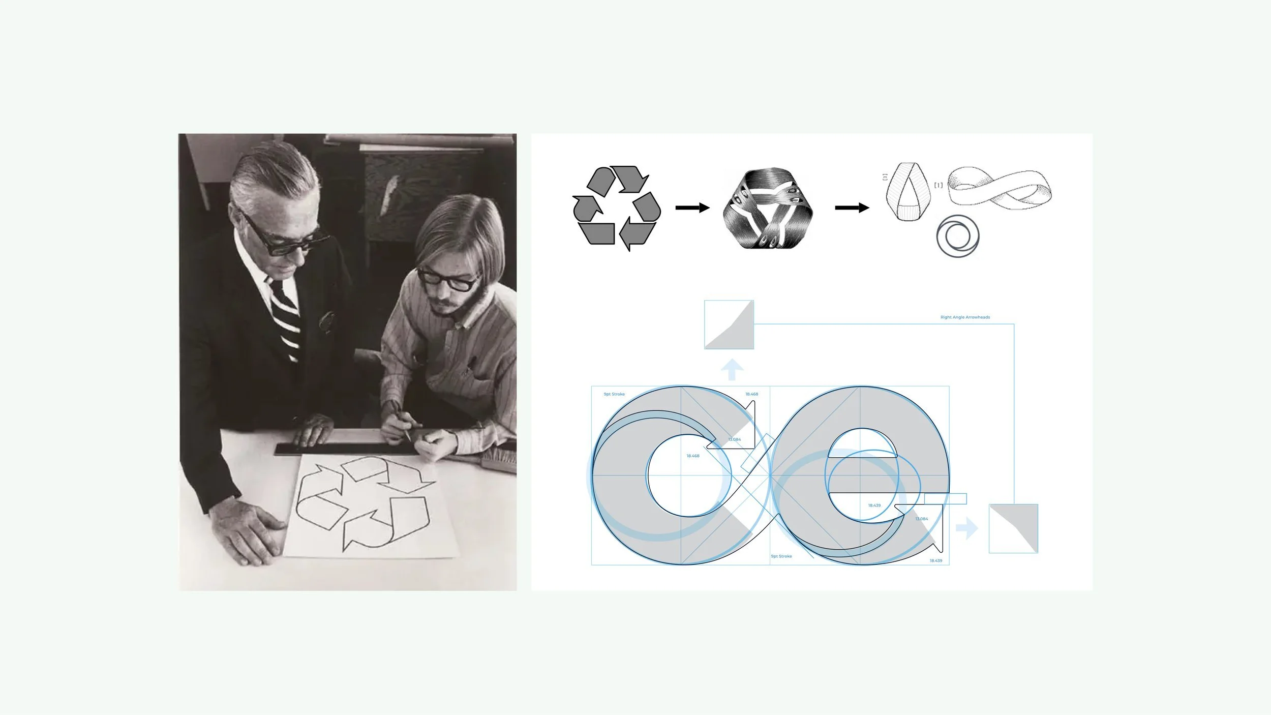
Our approach was to delve into the history of the iconic recycling symbol and evoke the nostalgic charm of vintage globes. With every visual element, we conveyed a genuine sensation of an attainable future from the knowledge that we are actively working towards a better, more sustainable world.
We aligned with the company's objectives to craft an extraordinary brandmark and visual identity system that resonates as a symbol of world-class excellence. By blending heritage with innovation, we created a distinctive mark that represents our client's vision and sets them apart in the global market.
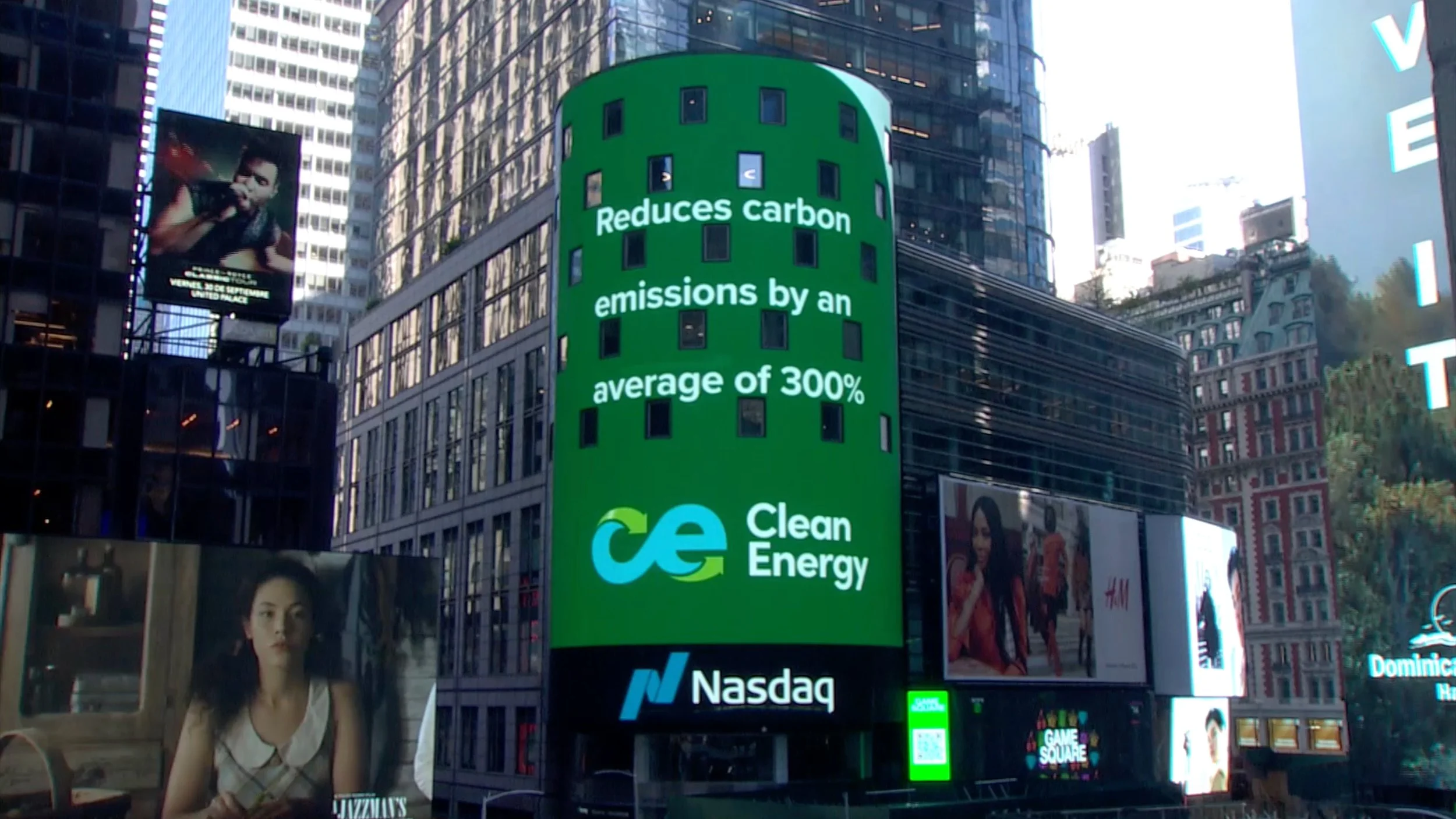
Our unique brand identity fostered unmatched market confidence, driving a remarkable 300% stock price surge from $4.29 to $17.29. This success perfectly aligned with the company's repositioning efforts.
CREATIVE STRATEGY
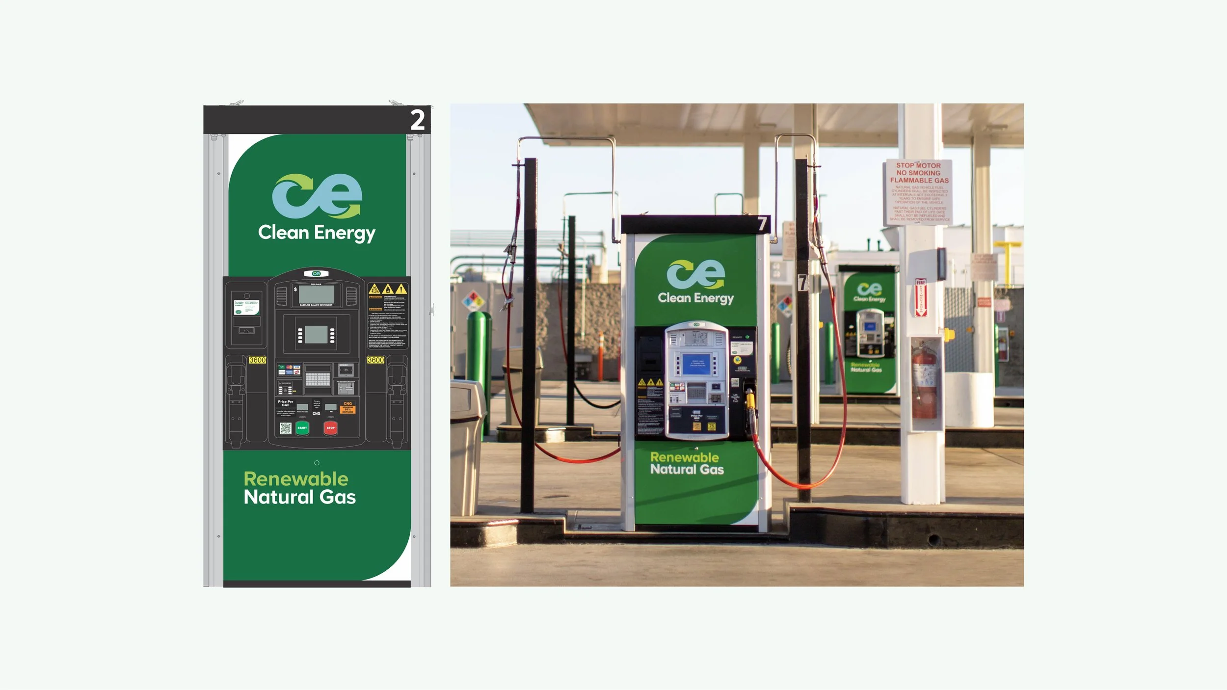
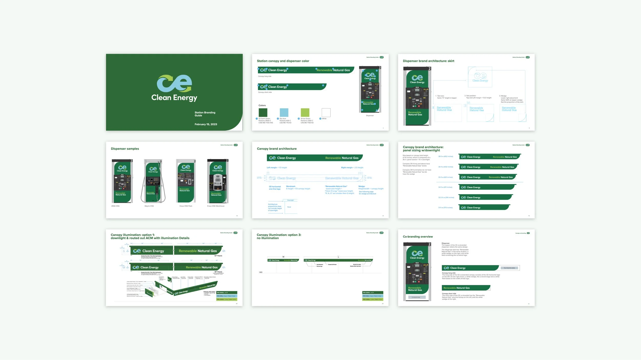
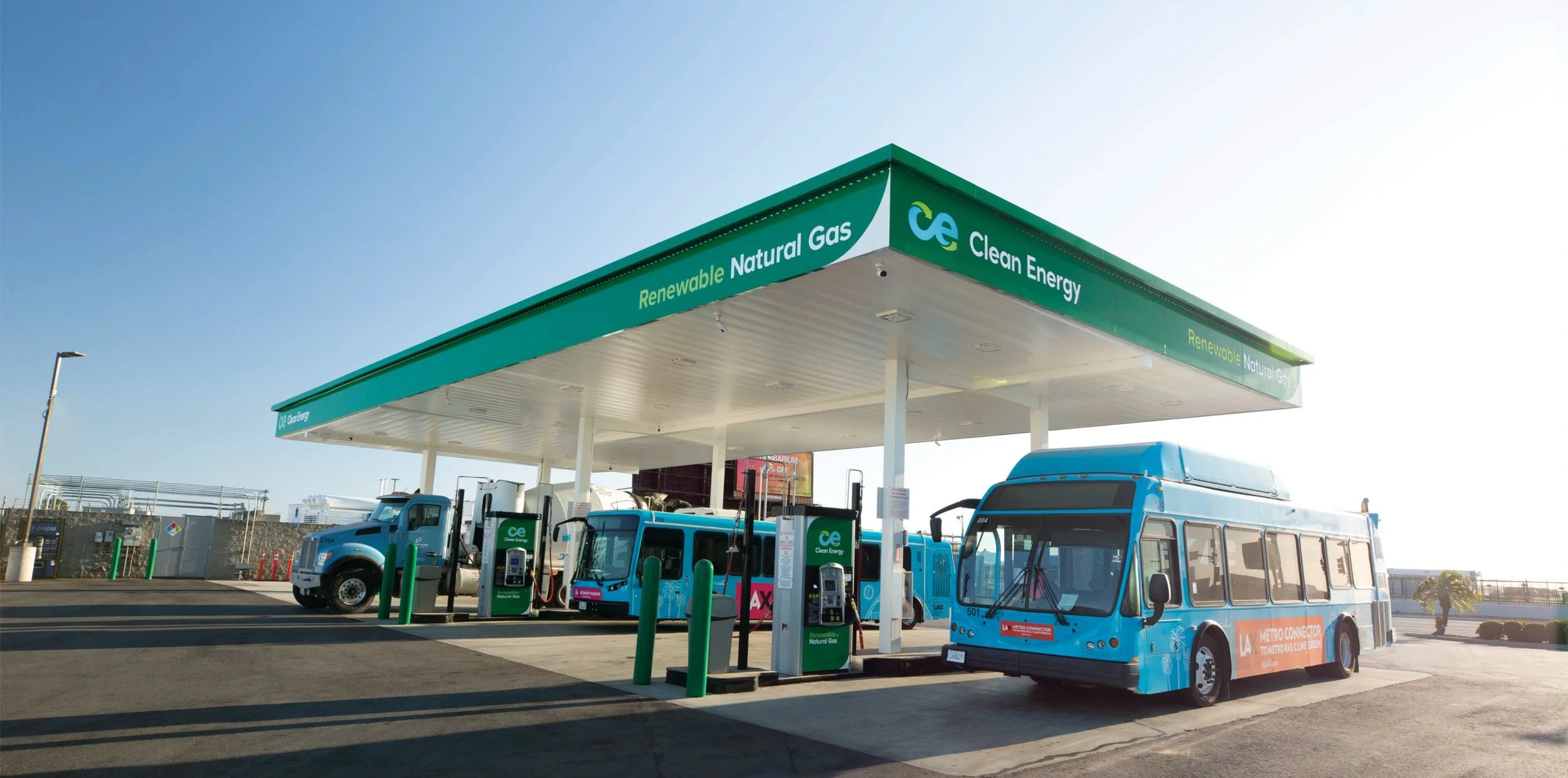
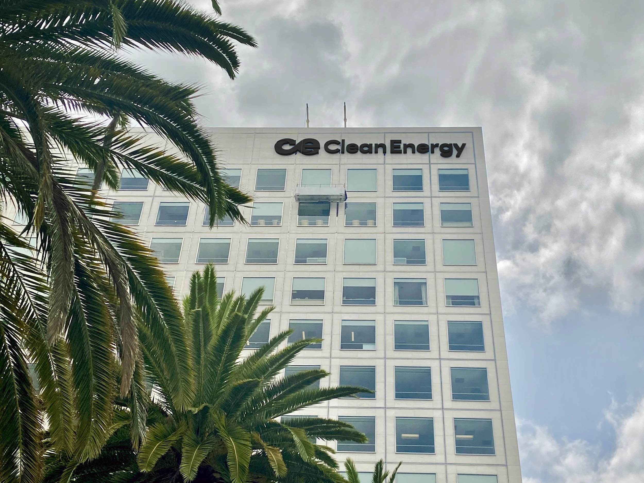
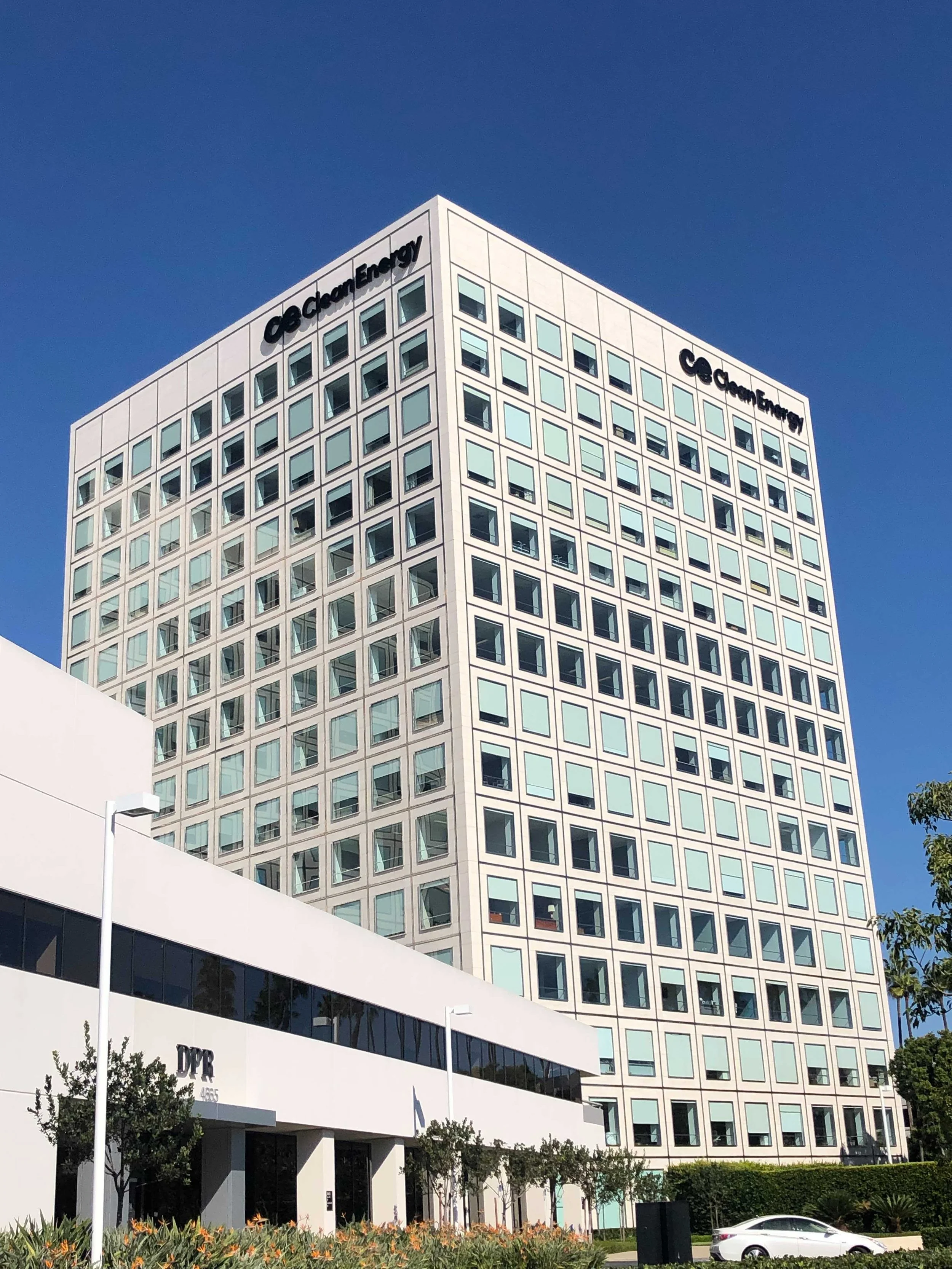
Clean Energy decided to reposition the company around its renewable natural gas (RNG) offering. As the largest provider of RNG for the transportation industry, Clean Energy helps customers achieve their carbon reduction goals by turning greenhouse gas into renewable vehicle fuel. We were entrusted to rebrand Clean Energy to align with their new positioning.

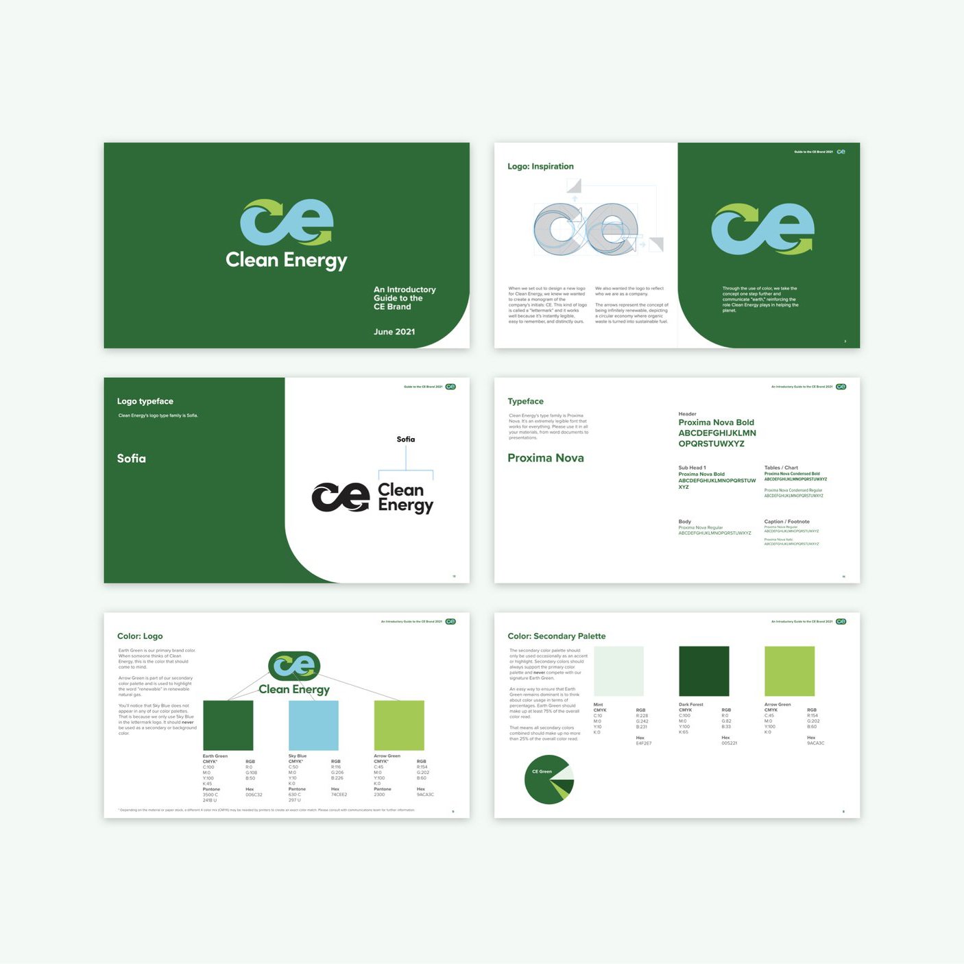
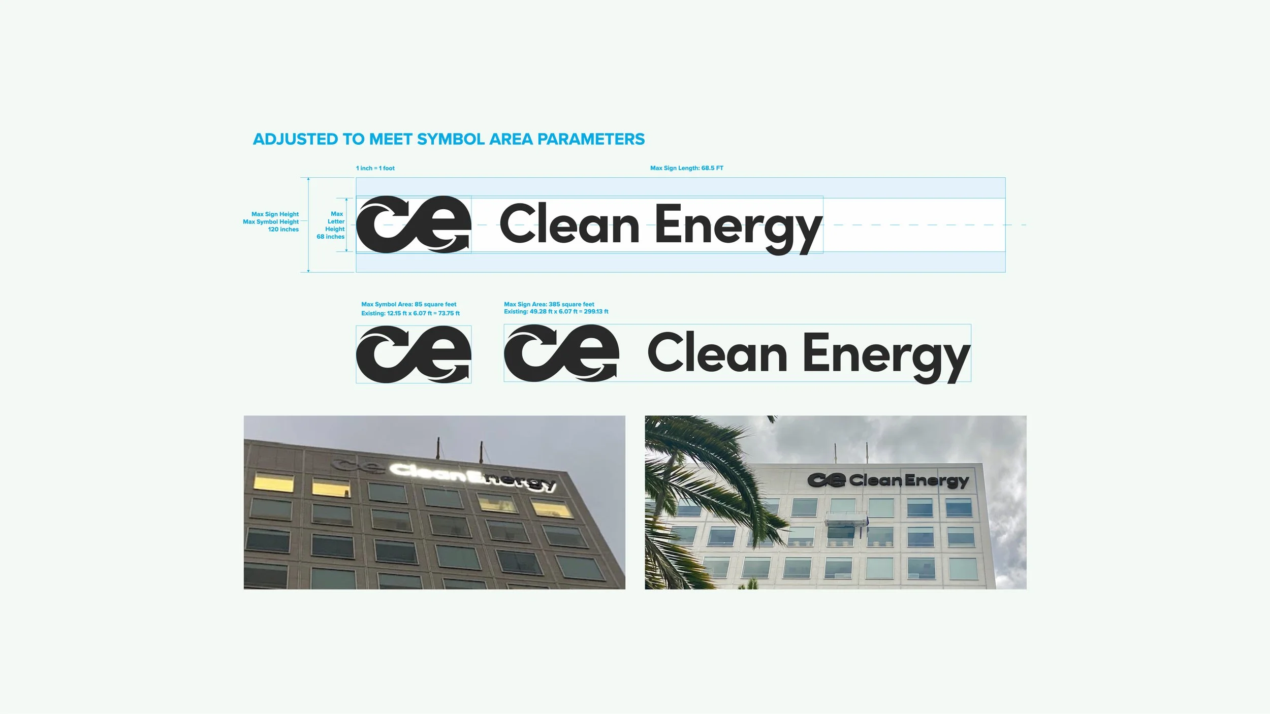
LOGO DEVELOPMENT
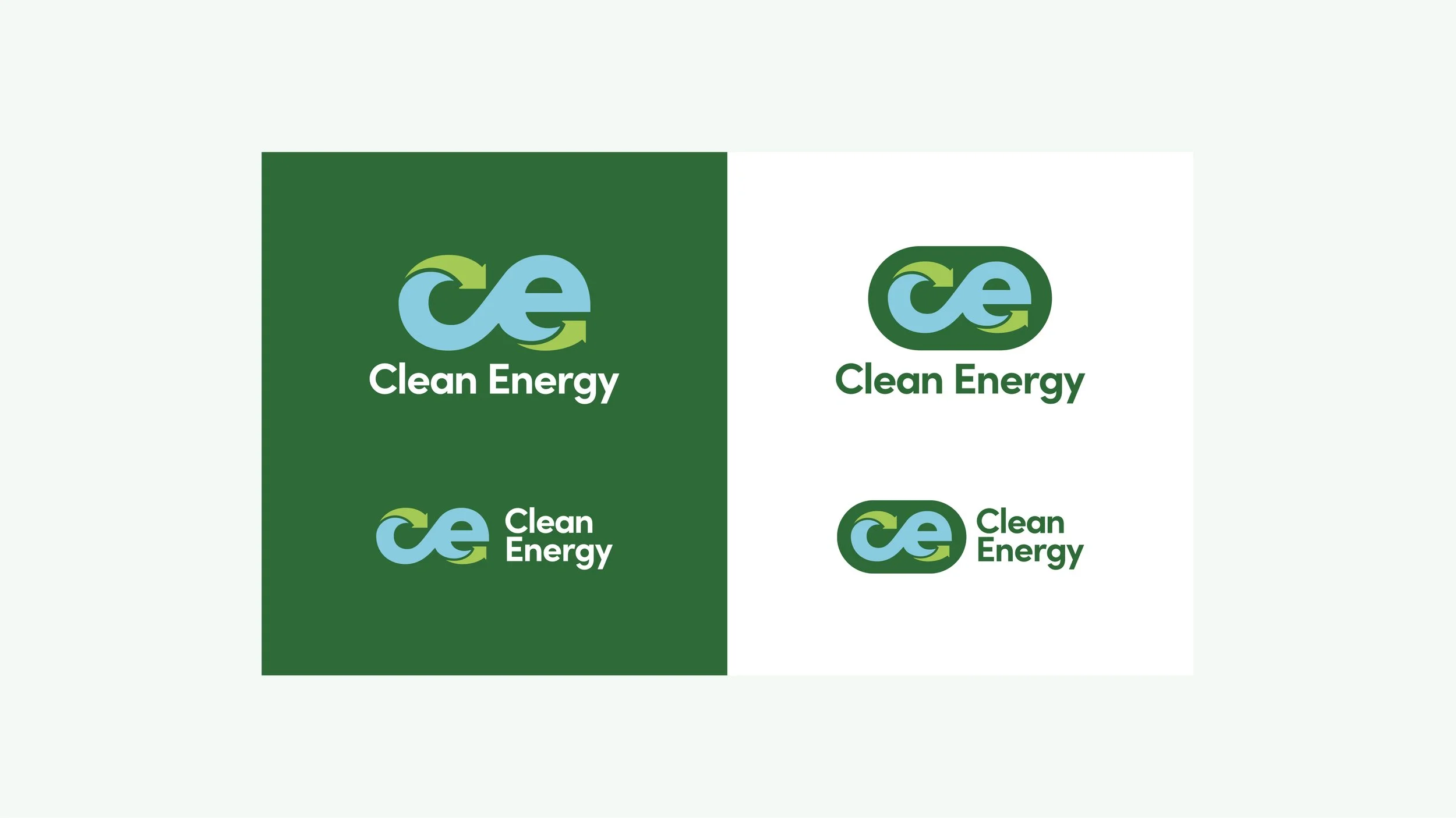
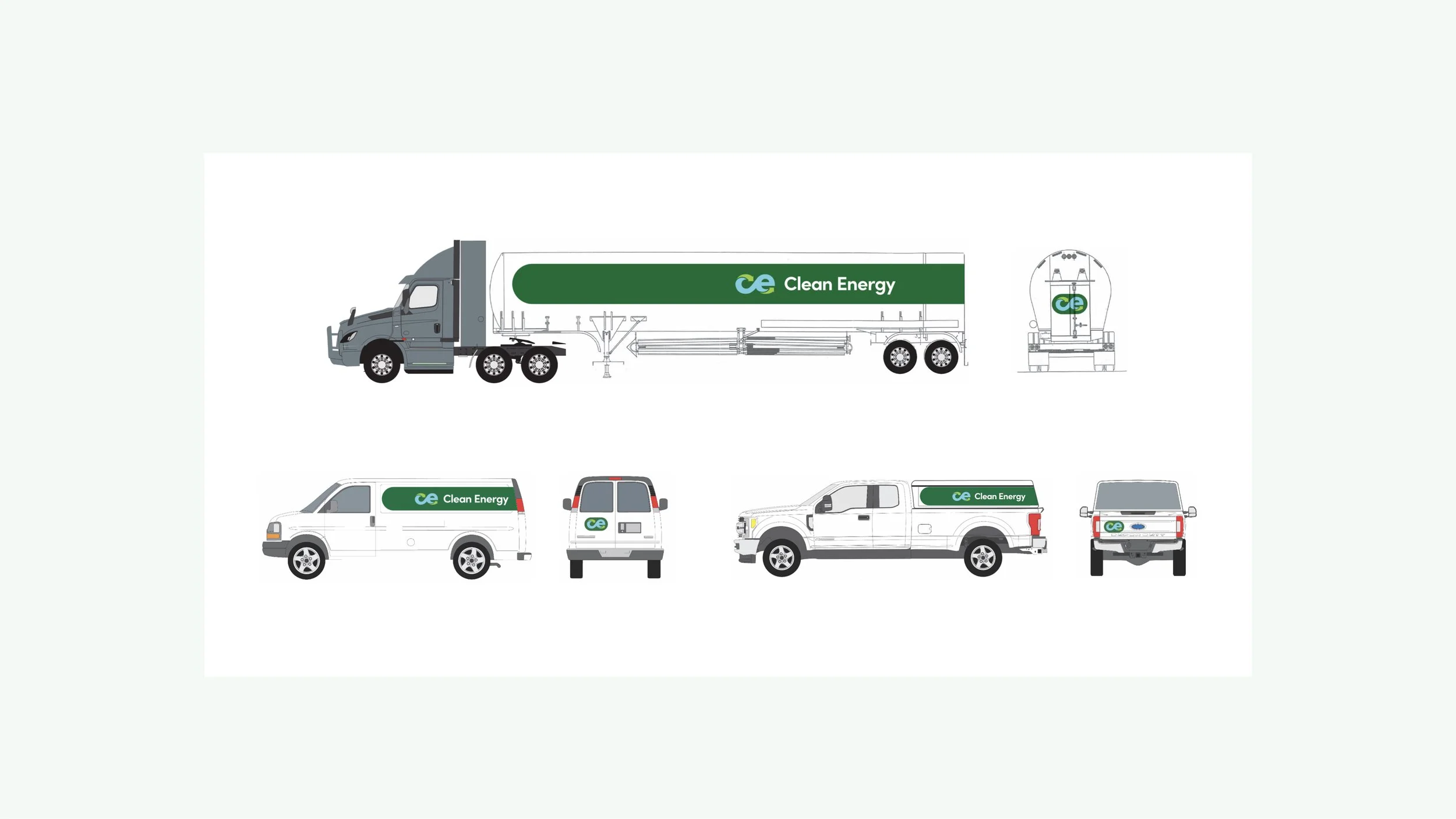
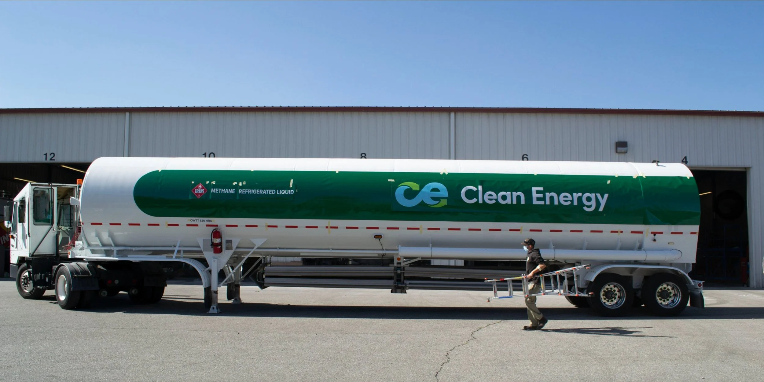
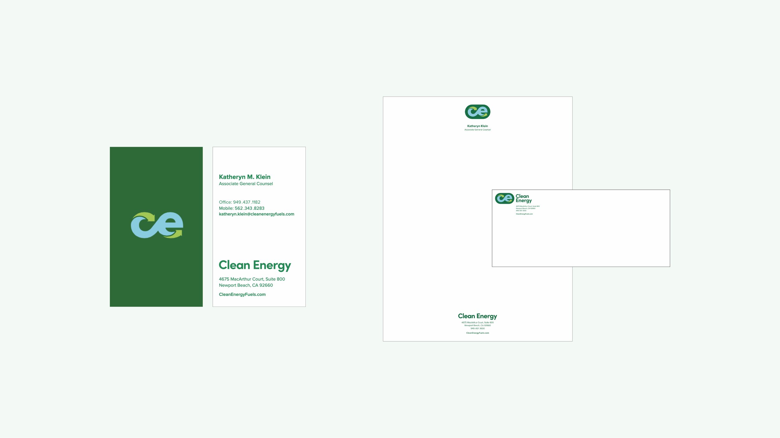
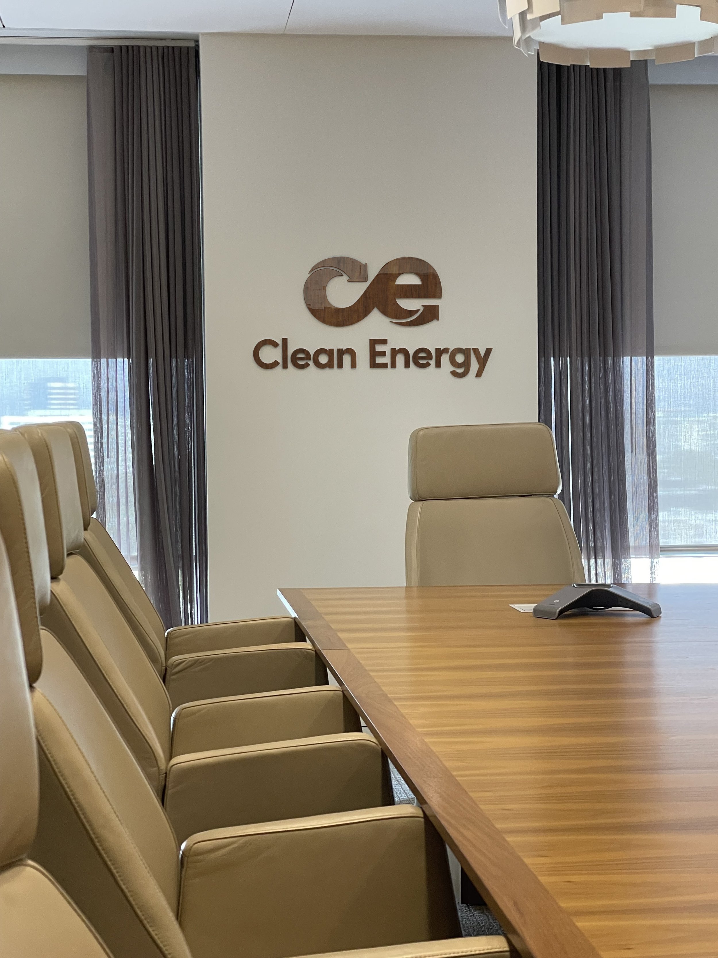
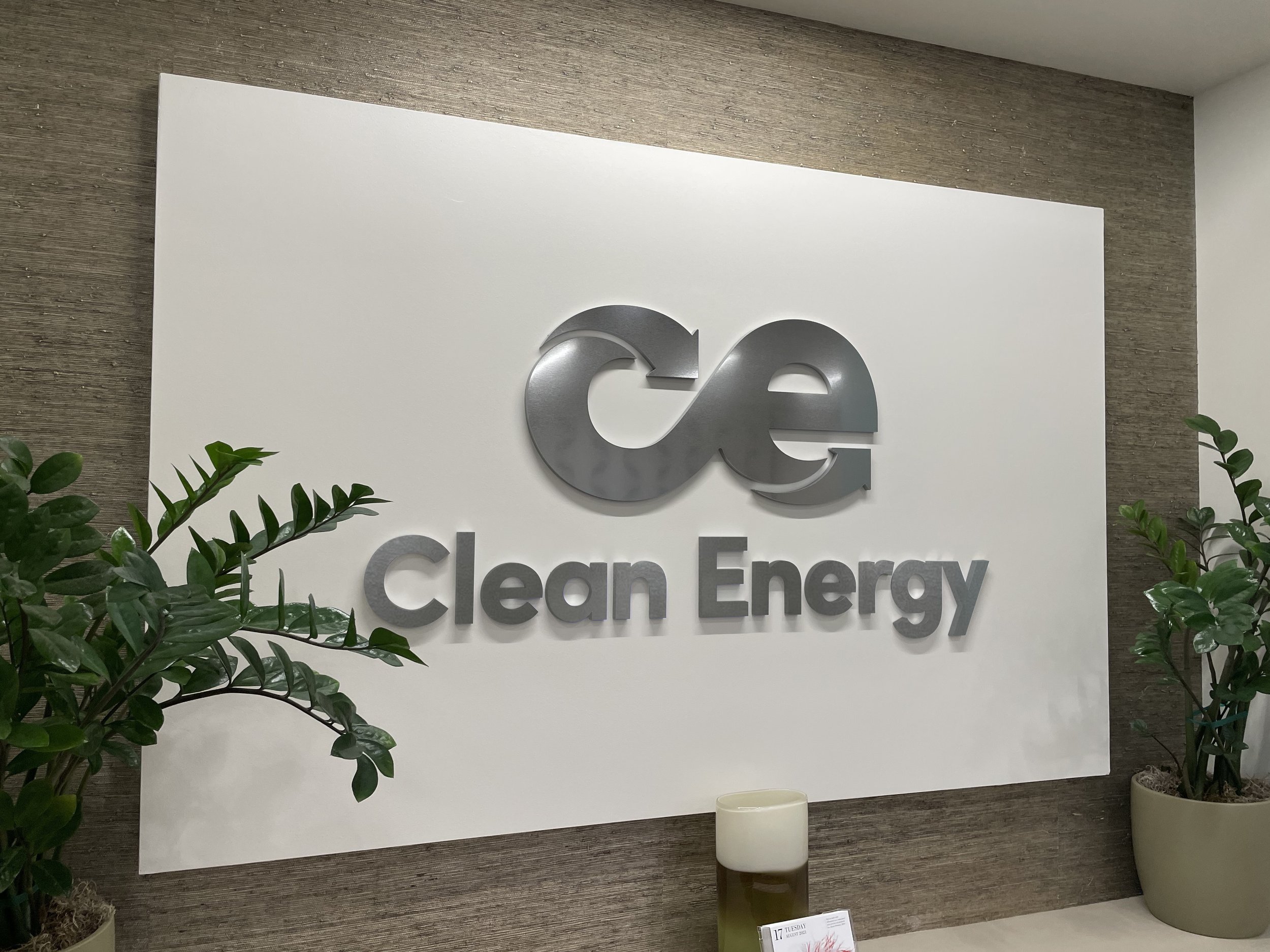
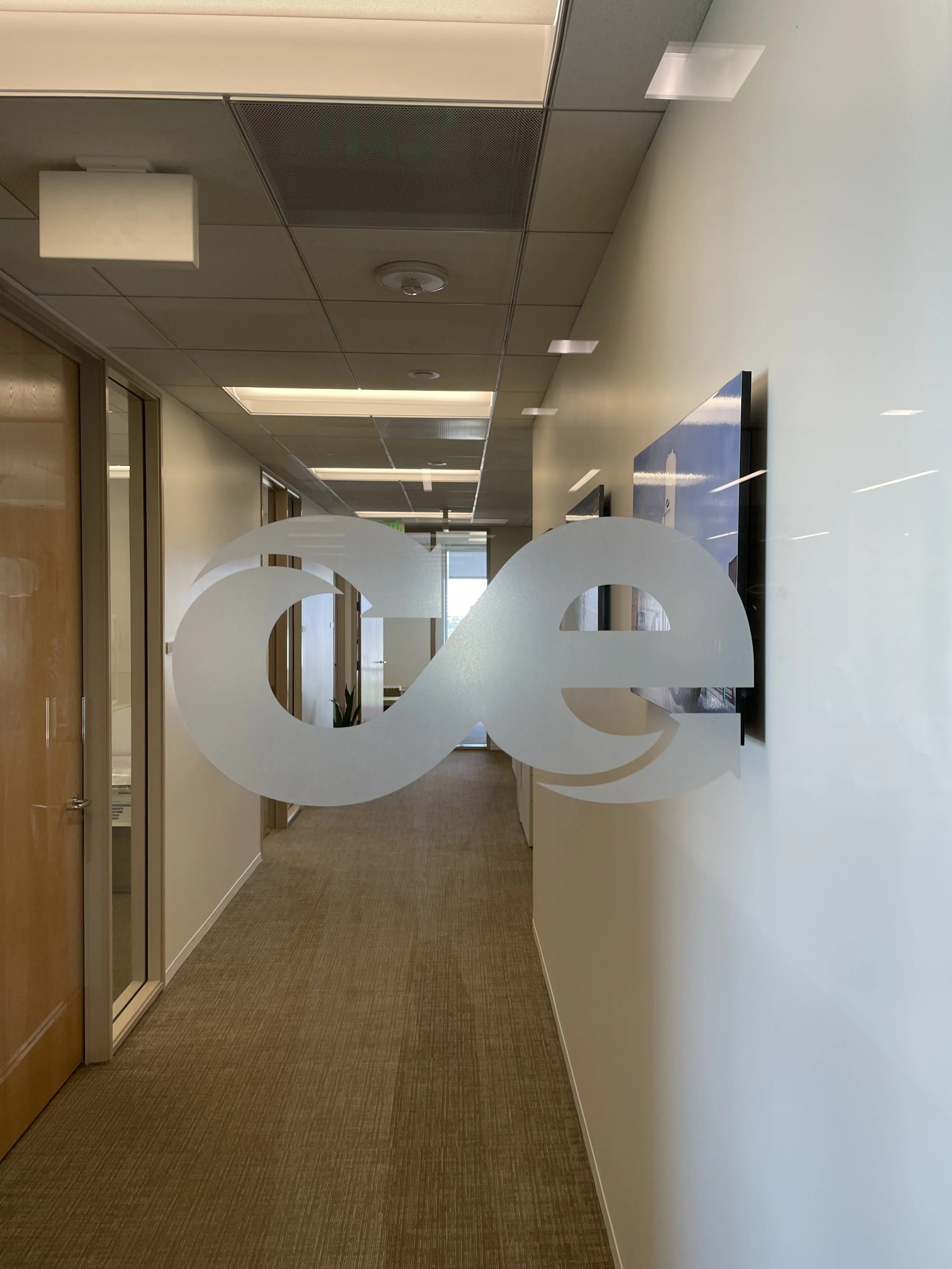
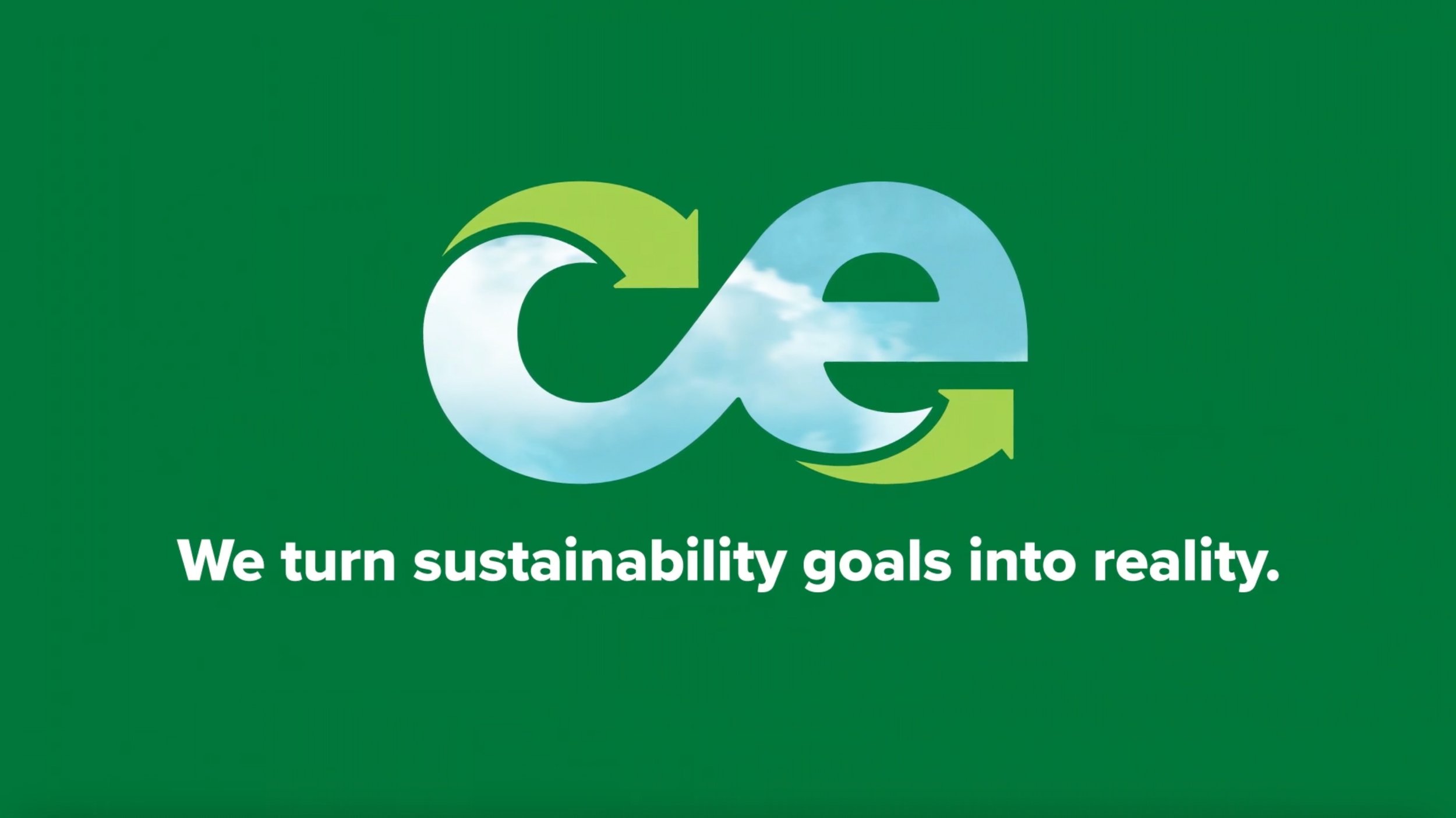
We developed a new logo and complete visual identity system that reflects Clean Energy’s commitment to a zero-carbon future.
The inherent symmetry of the lowercase “ce” evokes the infinity symbol and ties in perfectly with Clean Energy’s renewable fuel solution.
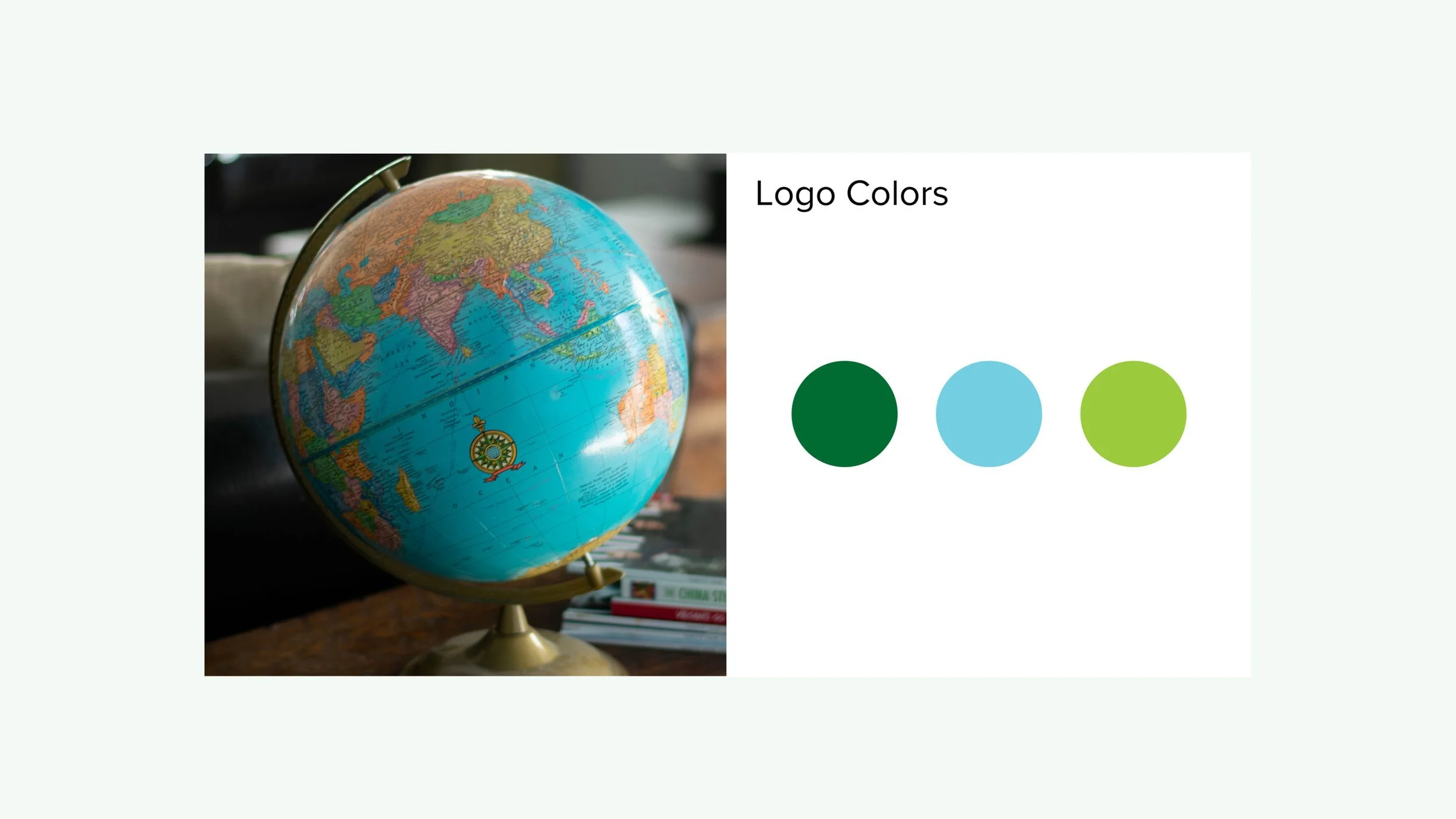
Inspired by classic globes, the use of color takes the logo concept one step further by communicating “earth” and reinforcing Clean Energy’s sustainable solution.
VISUAL IDENTITY SYSTEM
Conceptually, green represents sustainability and the environment, while blue is associated with clean air and blue skies.
To ensure that our primary brand color read is always green, we limit the use of blue solely to the logo, and rely on additional tones and shades of green for our secondary palette.

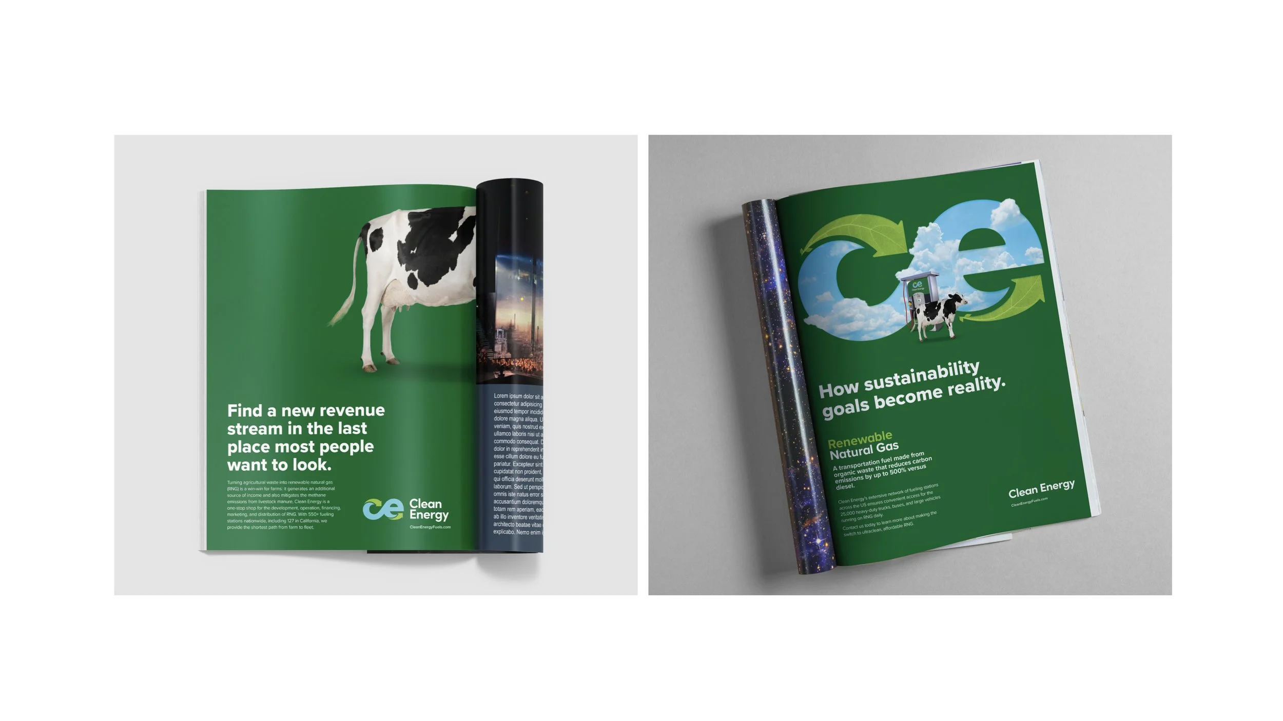
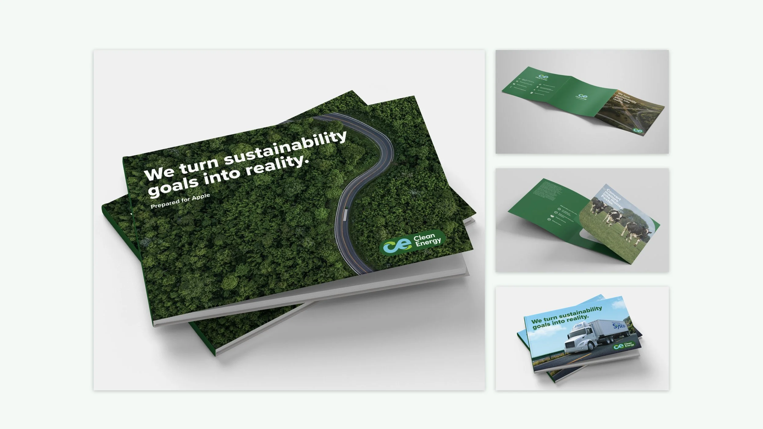
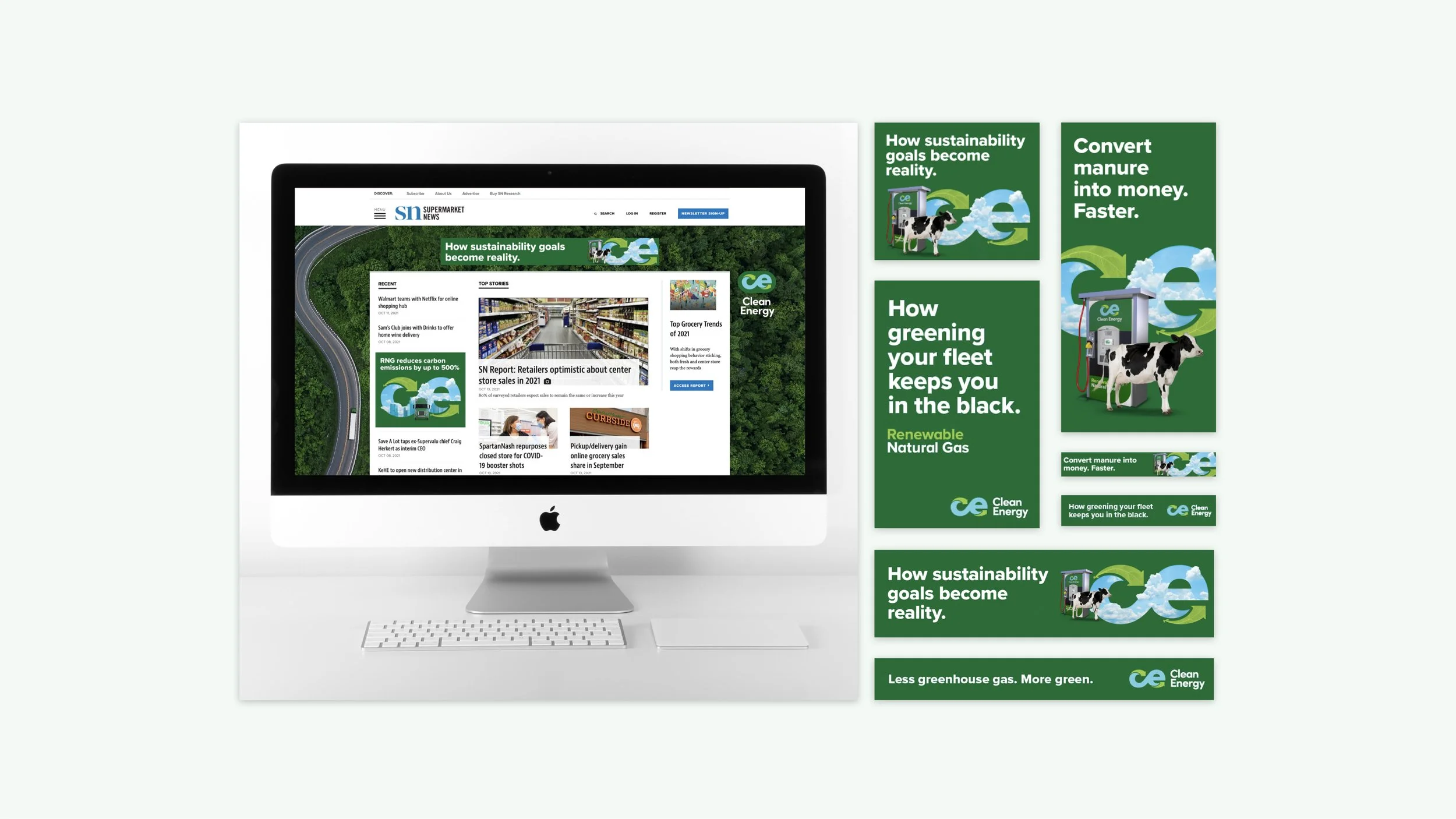
INTEGRATED CAMPAIGNS
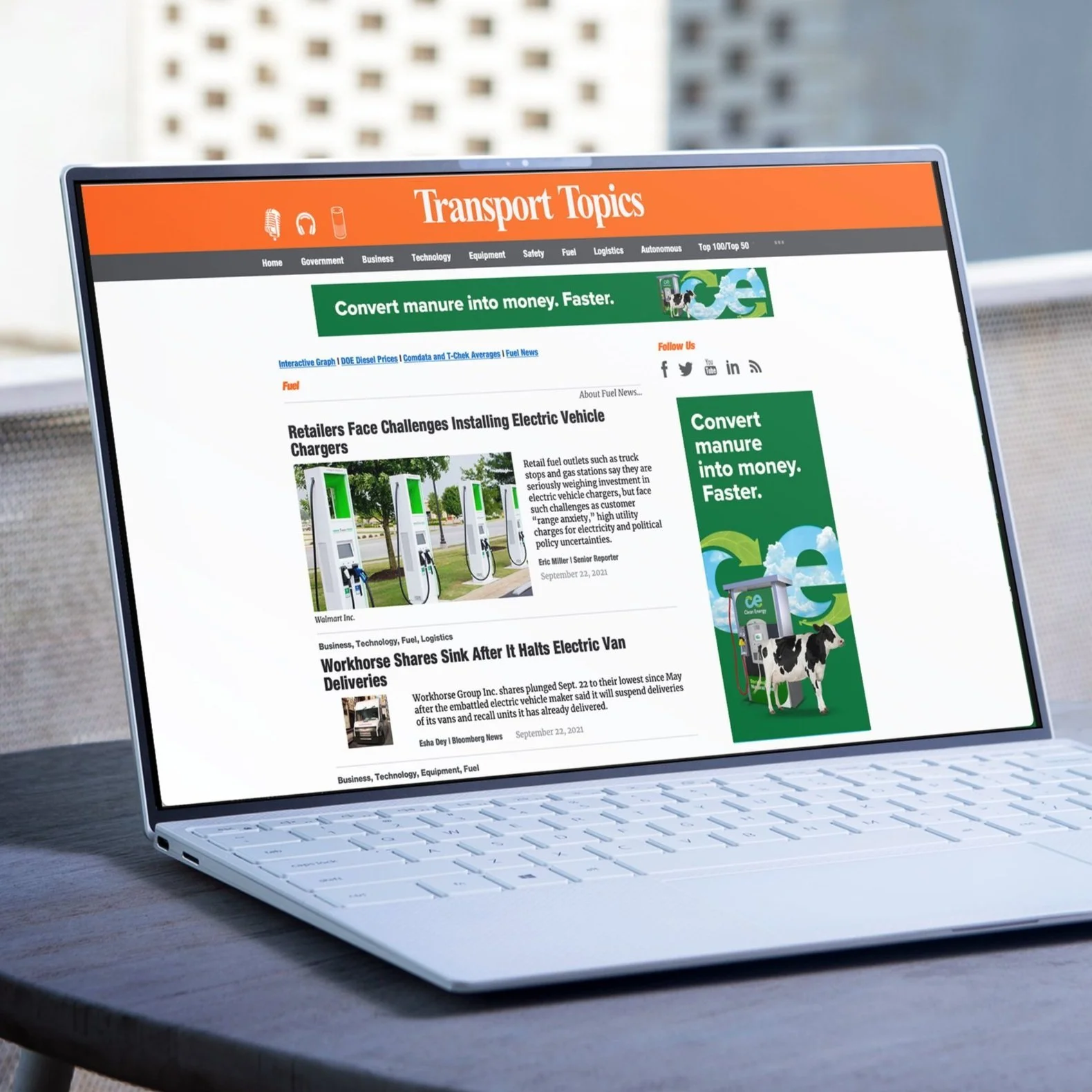
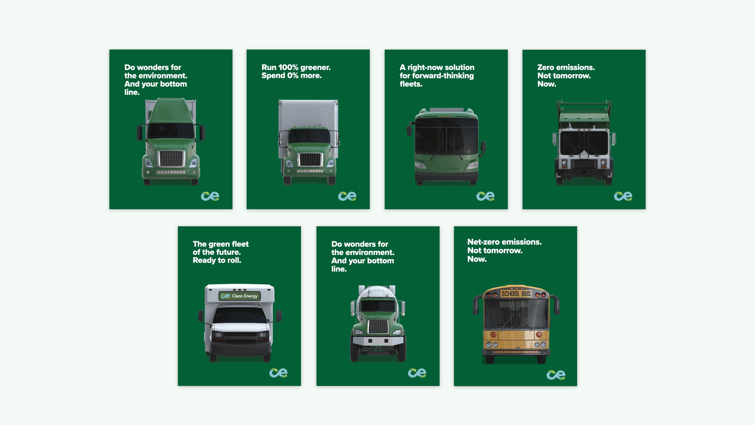
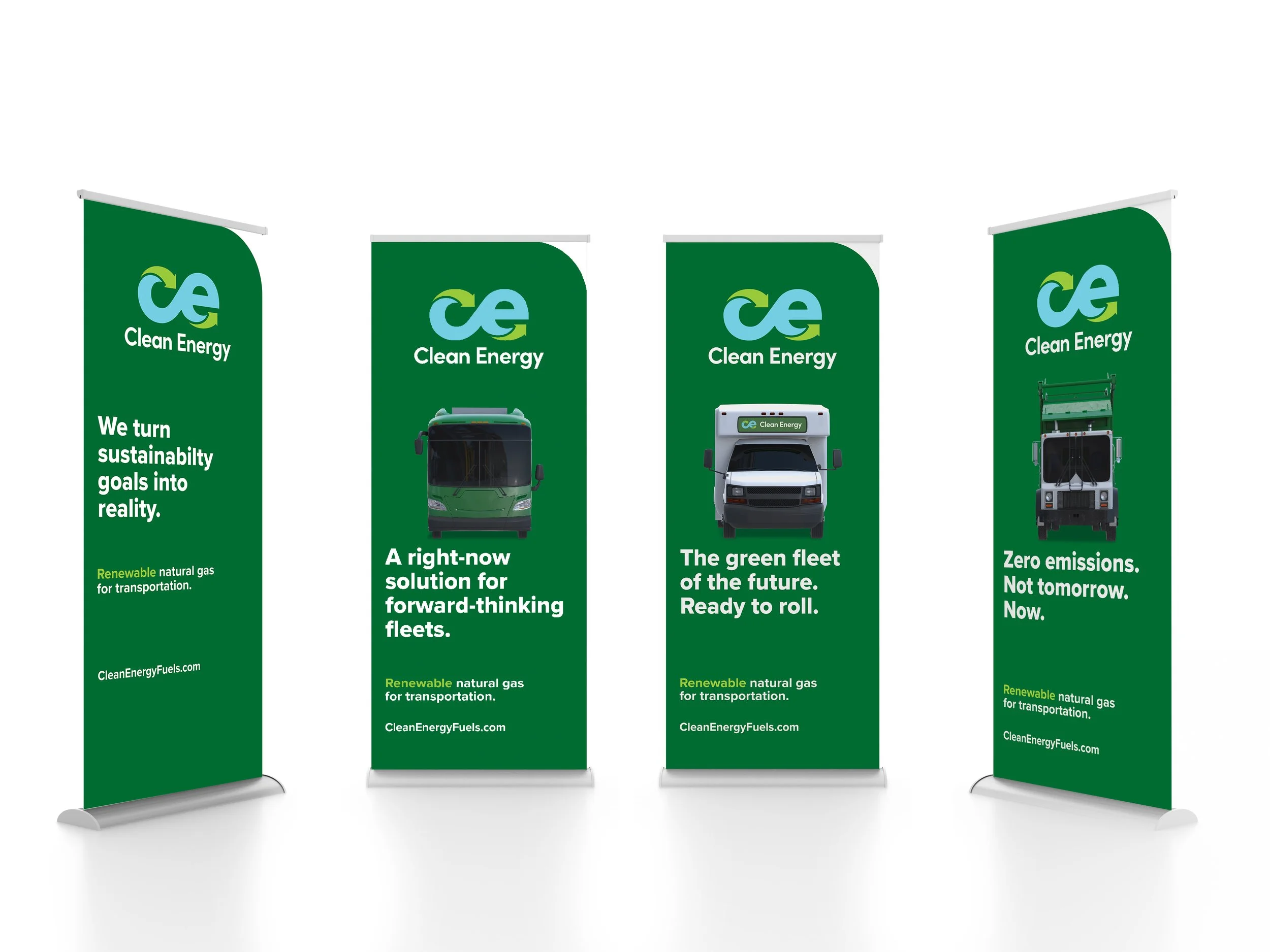
Developed an overarching advertising campaign for Clean Energy to match the brand’s new look & feel. It consisted of multiple target audiences within the campaign, but ultimately all of the creative familied together as part of the same campaign. Some media placements were relatively broad to capture a few different targets (i.e.: digital banners on WSJ.com to reach CSR officers, shippers, and investors) and others were extremely specific (i.e.: to reach dairy farmers). Campaign assets were a mix of print ads, digital banners, and pre-roll videos.
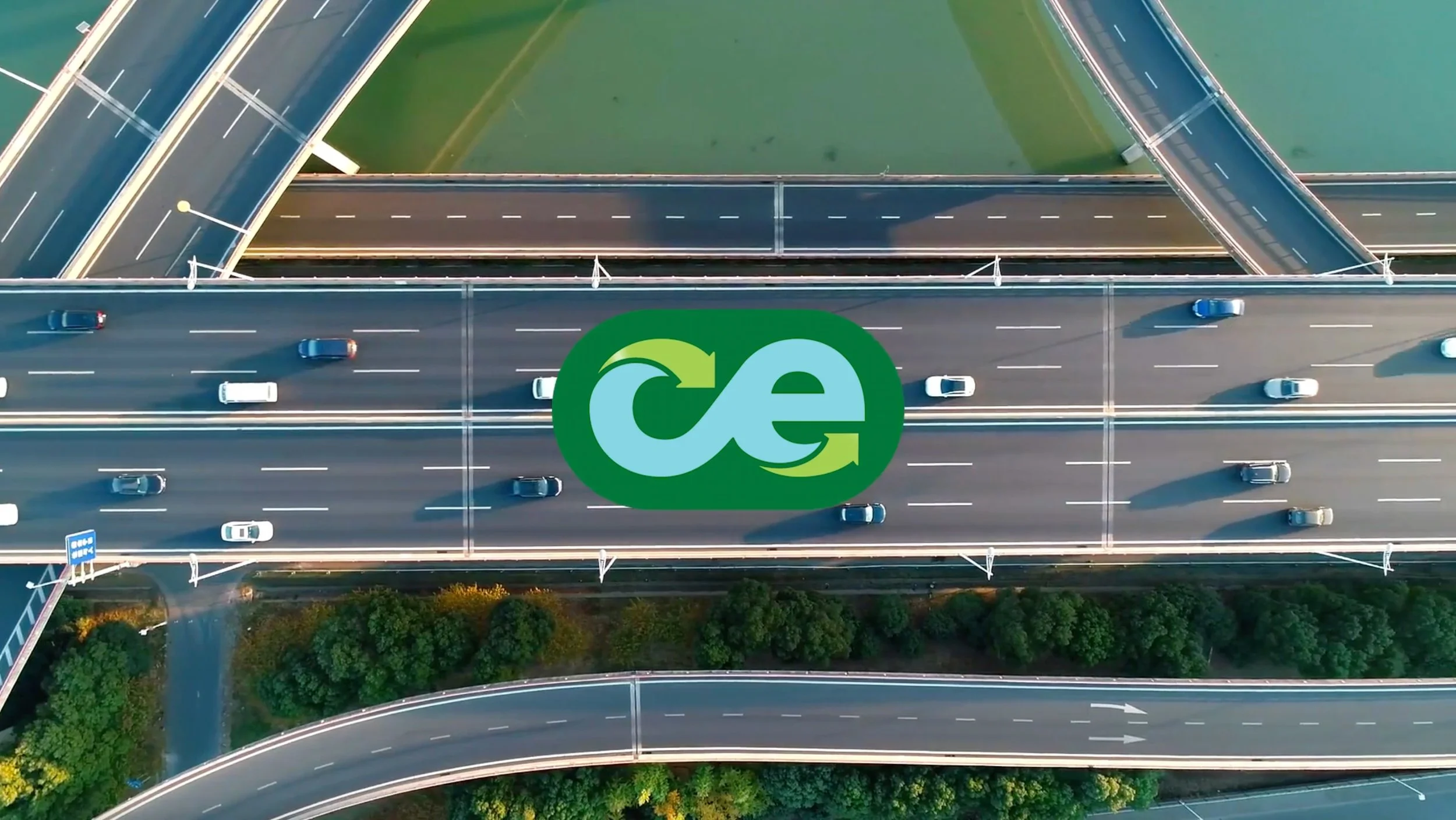
OUT OF HOME
“It is absolutely a work of art…flawless…
Clean Energy can now proudly sit with the big boy brands around the world…. Thank you, thank you, thank you”
BRAND VIDEO
Agency: Arealab
Client: Clean Energy
Role: Art Director